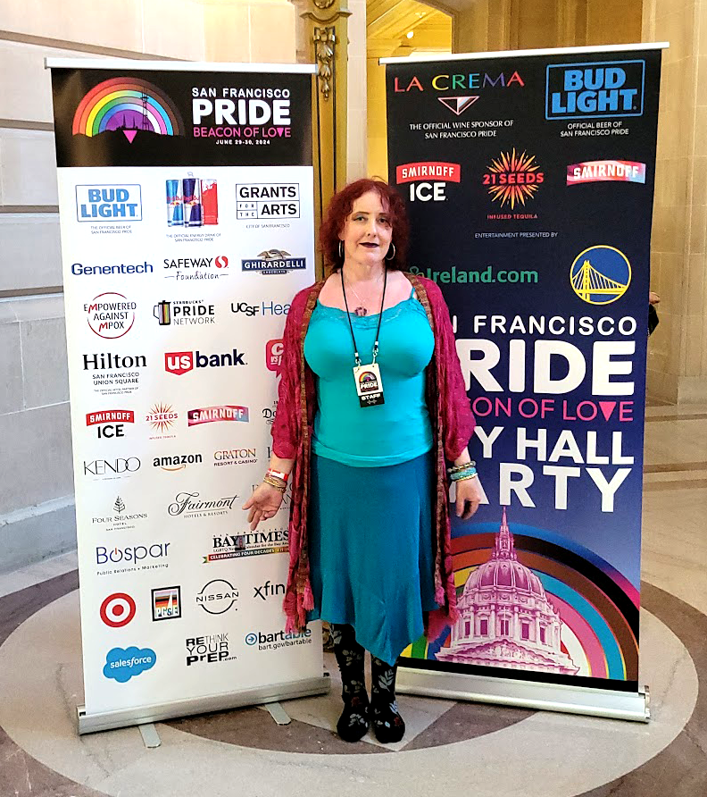
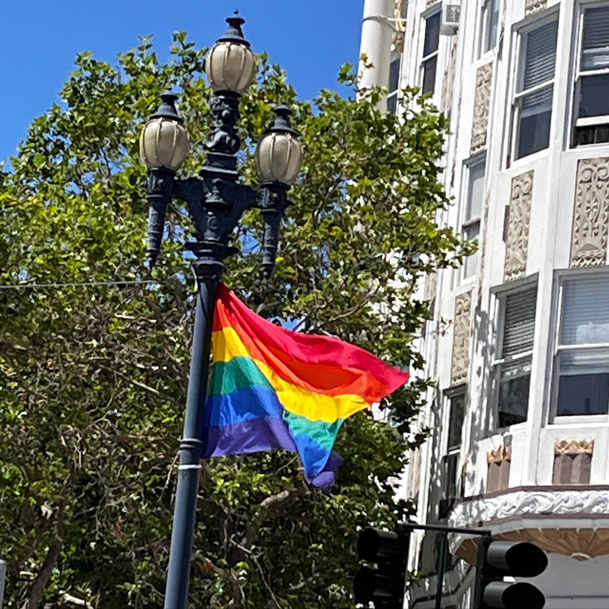
 Turquoise is my color right now.
When Gilbert Baker and friends made the first Pride flags they were looking for a more life-affirming symbol for the Gay and Lesbian movement than the Pink Triangle-the Nazi symbol for queer prisoners in concentration camps.
An LSD trip in a gay disco in 1977 led Gilbert to the rainbow, so he tells it. “There were long-haired, lithe girls in belly-dance get-ups, pink-haired punks safety-pinned together, hippie suburbanites, movie stars so beautiful they left you dumbstruck, muscle gayboys with perfect mustaches, butch dykes in blue jeans, and fairies of all genders in thrift-store dresses. We rode the mirrored ball on glittering LSD and love power. Dance fused us, magical and cleansing. We were all in a swirl of color and light. It was like a rainbow.
A rainbow. That’s the moment when I knew exactly what kind of flag I would make.”
Originally in 1978 there were eight stripes: the 6 we have now-RED for LIFE, ORANGE for HEALING, YELLOW for SUNLIGHT, GREEN for NATURE, BLUE for SERENITY and PURPLE for SPIRIT-but also HOT PINK for SEX and TURQUOISE for MAGIC. Some versions included a blue field with white stars, emphasizing that gays and lesbians were entitled to the ideals of liberty and equality espoused in the founding of America.
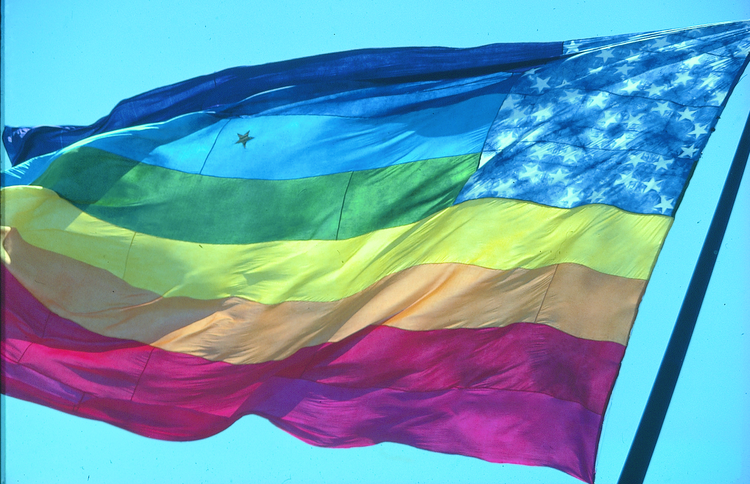
But the flag quickly changed. The hot pink was removed in 1979 due to a worldwide shortage of hot pink dye…and the turquoise was removed because 6 was more symmetrical for hanging on Market street lamp posts.
These are two rather mundane and pedestrian reasons for removing SEX & MAGIC, if you ask me.
The Progress flag is now the predominant symbol for our borderless LGBTQIA nation, as many felt the need to explicitly include people of color and trans people in the representation. I have no quarrel with it, the community group conscious felt strongly that long-standing problems of inclusion needed to be centered.
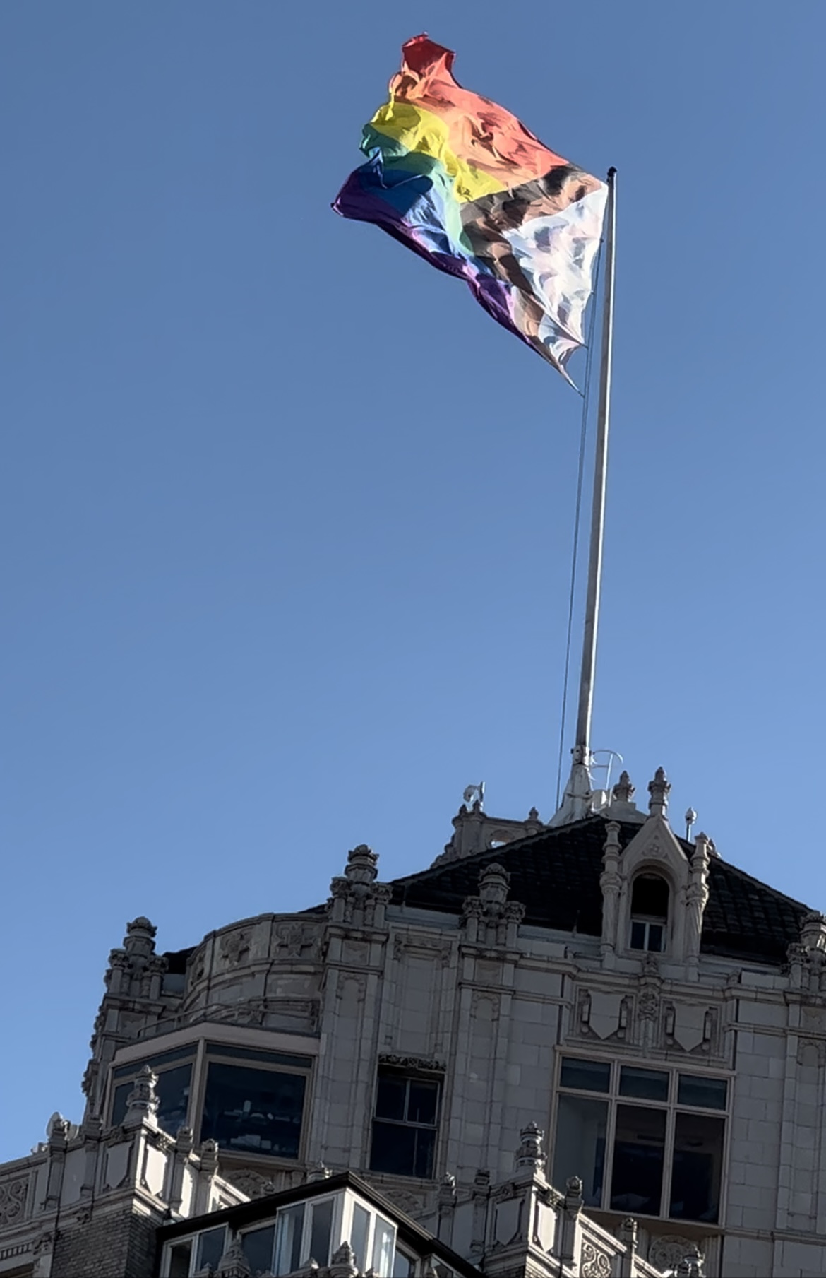
I’m saddened that it wasn’t possible for everyone to see themselves and their humanity included in the Pride colors symbology, but perception is reality and symbols change to reflect that reality.
Aesthetically? For a designer, it’s a hassle. It’s hard enough to work with a 6 color rainbow, but adding five more colors on top of it is really challenging. I’m not a fan of the trans colors, personally. Baby blue and pink pastel? Ugh. The most boring and gender oppressive colors for us magical gender beings, if you ask me, but nobody did.
The new SF Pride logo (2024) by Nicole Bloss enshrines the progress colors in a gradient rainbow and reincorporates the Pink Triangle in the symbology. Symmetry again forces a compromise, as an EVEN number of colors are required, thus Purple Spirit is removed from the SF Pride Progress Rainbow. I try to use it as a ground for the logo when I can so we don’t entirely lose SPIRIT.
Nicole set the logo in a black frame, which works well to contain the disparate colors, and also sets off the hot pink text and triangle (black and pink is a killer combo, feminine and bold).
I went with the black in a lot of the marketing for Pride, notably in the Kaiser Permanente Main Stage design and branding. At some point I broke the logo apart to emphasize the “Beacon of Love”theme and let the San Francisco Pride typography Nicole created to stand on its own. The progress rainbow gradients also appeared in linear form as a design element.
![]()
Anyway, bring back Sex and Magic, that’s what I say! So if you see me use those colors, you know what I’m talking about.